by: Madison Stevens
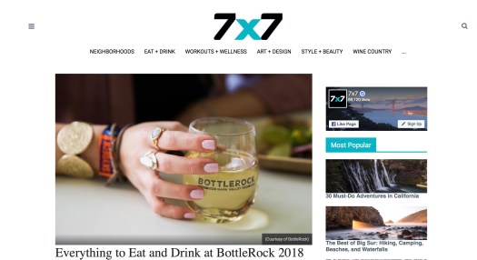
This blog is drawing in the viewer with a clean organization and aesthetic. The top of the blog provides a large photo and then draws the viewer in with a crisp headline. The blog is overall attractive because of its simple coloring. The ads do not make the blog cluttered and the author provides links to social media sites in a coordinated way. The blog gives you an inclusive understanding of the food and accommodations at the festival, however the music is never mentioned which is a highly lacking part to the blog.
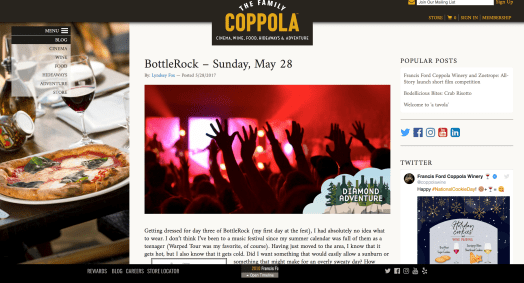
This blog is not drawing viewers in because of the overall aesthetic of the blog. The coloring choice is poor and the format is extremely messy, straying the viewer from the writing and visuals of the blog. The blog uses a lot of ads and too many social media links all over, scattering the viewer. The blog uses non-personal pictures which is helpful in this blog because all the photos used are related to the materialistic aspects of the festival. However, the blog would be better if the author also provided a personal visualization from the festival to assure the viewer the author is personally informative about the festival.
