by: Sophie Cataldi

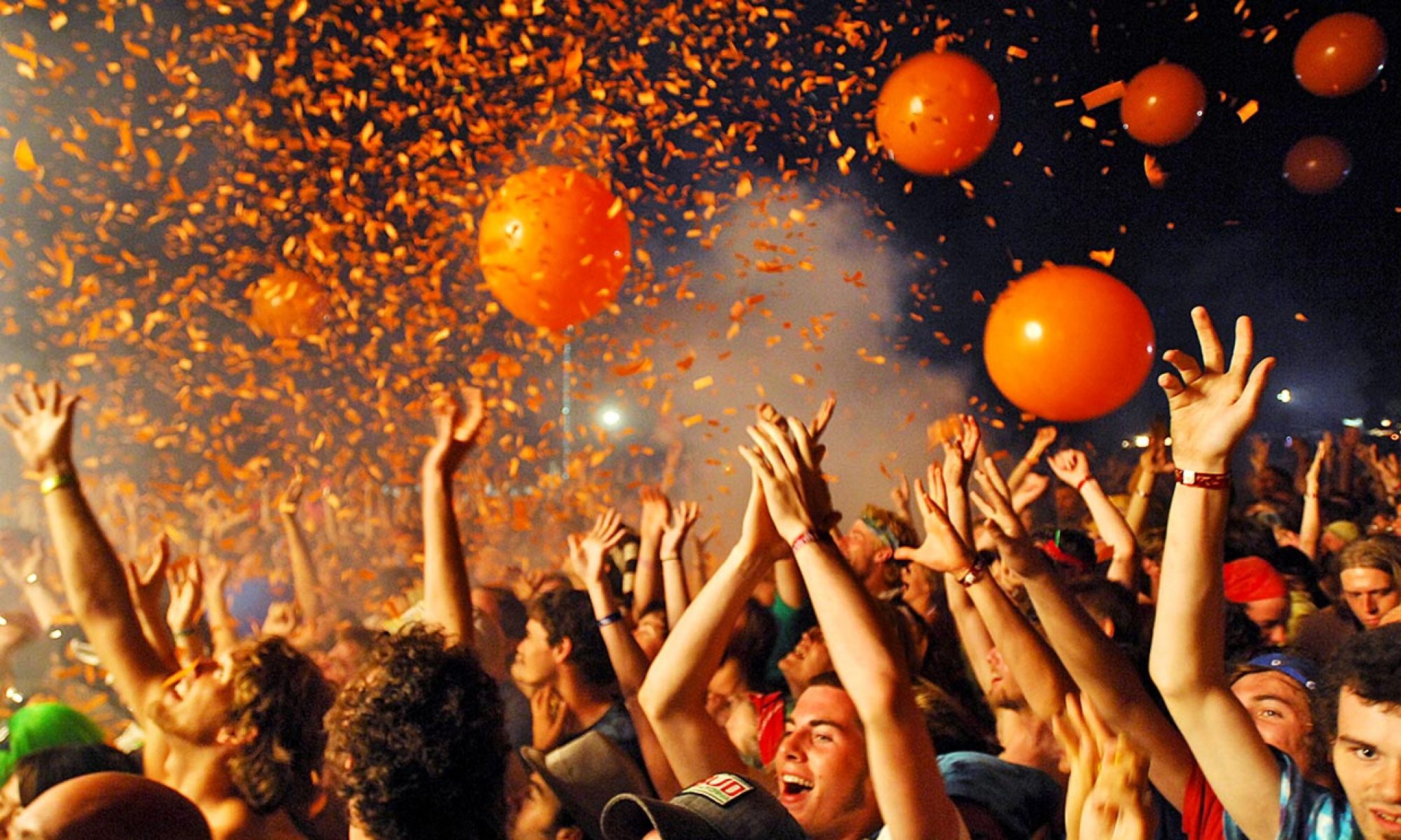
The Blonde Abroad has created a successful, intriguing site for readers through many aspects. First, her main theme and menu page are very aesthetically pleasing and easy to navigate, causing viewers to continue reading. Although her Beginners Guide to Burning Man post begins with a very large image of herself, the small About section on the side makes her blog personal and gives great background information for new readers.
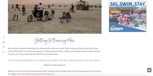
The organizational style of her posts include a great ratio of text and visuals, creating posts that captivates readers. She includes photos between sections of text and ideas, using media to engage readers. As you can see, her text is split up into smaller sections and broken up by appealing page breaks. She also incorporates different fonts, text color, size, and other text styles in order to make certain ideas or suggestions stick out to readers.
The Blonde Abroad provides links to the Burning Man website, products she suggests festival-goers purchase, and her YouTube channel, providing more insight and user-friendly content to readers.
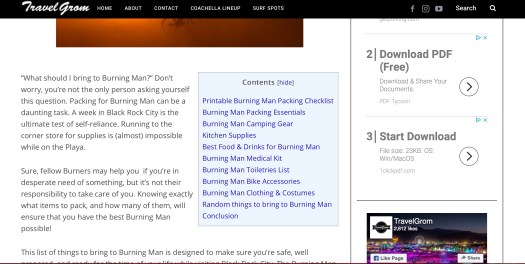
In comparison to the previous blog, Travel Grom has multiple flaws. When first opening up his post about Burning Man, there is a large chunk of text accompanied by a table of contents and big advertisements. This is unattractive to readers as ads feel shoved in your face, there is an intimidating amount of text, and the table of context is unappealing.

Travel Grom does offer links to users, such as the table of contents and the downloadable packing list pictured, which is appealing to readers as it makes their lives easier. Although he provides links, they are highlighted in bright blue which does not flow with the aesthetic of his blog. But, the amount of advertisements on his site cover the side and bottom of his page, which is very annoying and distracting.
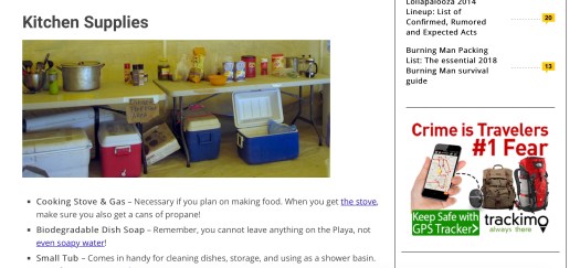
The photos he uses within his blog are also a flaw. They are unedited and he seems not to care about the presentation of them. I believe he could put a bit more effort into the visuals throughout his blog. The aesthetic of his blog does not flow or look appealing, seems that he does not really focus on the looks but more on the content, which is ineffective as a blog should focus on appealing to readers.
