by: Lydia Crowley
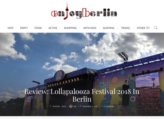
This blog draws in viewers at first glance by providing an organized header that allows website visitors to easily navigate different topics within the same blog. Underneath the tabs is a large banner that includes a simple photo of the music festival as well as the title of the blog post. This visual and textual combination effectively sets the tone of the informative writing style that the author uses throughout the post. The heading is clear and concise with a simple introduction to the website and does not distract the reader from the topic at hand. The title of the website, tabs, and banner provide a “cover page” for the blog. To begin reading about Lollapalooza, the reader scrolls down and the content is provided on the left side of the page. To the right of the content there is an organized vertical space for external links and advertisements. As the reader scrolls through the content, they are scrolling past information on the blogger as well as various images of seperate social media websites. The website perfectly divides the content and external content in a way that does not clutter the page or distract the reader.
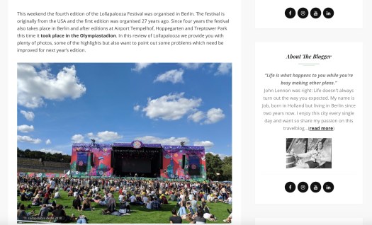
The author divides his writing by separating each topic with a new header, body text, and picture. His blog behaves similar to a timeline, where he starts off with the history of the festival and gradually goes into more detail about the actual festival itself. This blog is unique because it discusses the festival’s role in Germany and how it has improved over the years, displaying the author’s time, dedication and research of the topic.
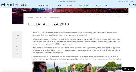
This blog “cover page” is similar to Lollapalooza Festival 2018 In Berlin’s blog where the website begins with various tabs as well as a cover photo of the festival. However, this blog is much more cluttered and unorganized. The header photo is too large and takes up a lot of space requiring the reader to scroll down in order to view the entire photo. Scrolling down only reveals that the photo is cut-off by the off-centered title and body text of the author’s experience at Lollapalooza. The body is centered to the right to allow space for the external links for Facebook and Instagram on the left side of the page that travel with the reader as they scroll through the page. This creates an unattractive format right off the bat, where the reader is disturbed by an excess amount of margin space on the left side of their view. The images included are not visually entertaining and have no relation to the author’s discussion. The body is disrupted by various images including a strip of horizontal images of restaurants that appear to be advertisements.
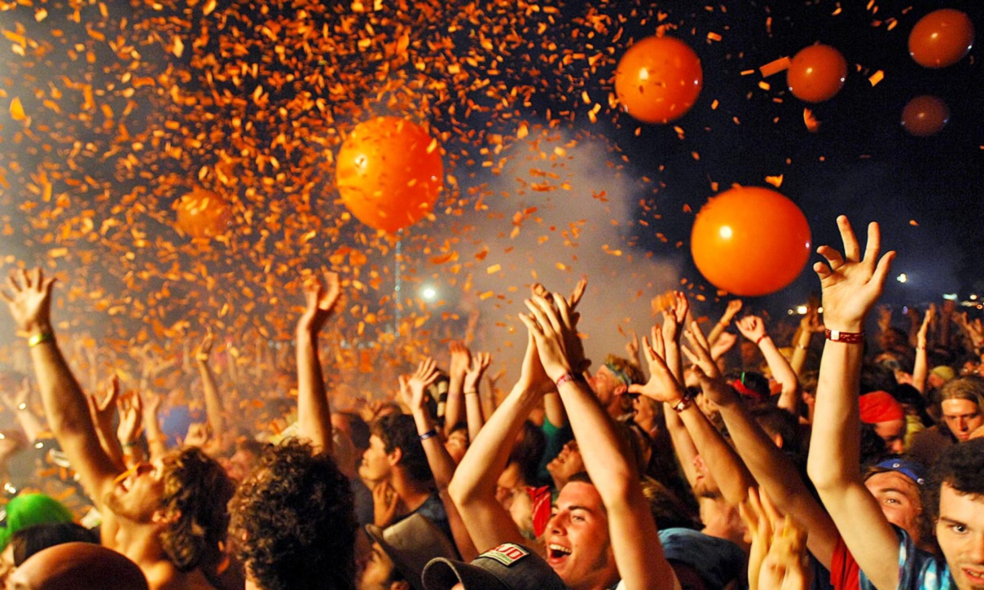
The author touches on various topics but does not organize them with any form of subheader or titles making this a very sloppy blog with little to no credibility. The opening frame leads with a cheesy hook that makes the blog seem rushed and unprepared. The blog is both visually and textually unorganized displaying a very immature knowledge on the subject.
